

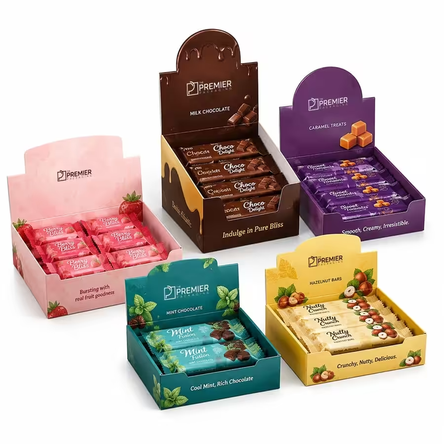
Savor the Story: Creative Packaging Designs for Confectionery Displays
Nobody buys truffles because they’re hungry. Obvious, right? But it’s weirdly easy to forget this while actually designing the box, because the instinct is always “make it look tasty.” That’s not really the job though. The real job is giving someone a reason to reach for it a gift, a treat after a bad week, some half-remembered flavor from a trip or a holiday and the candy itself kind of fades into the background of that decision.
Which explains a lot, honestly? Plenty of confectionery packaging fails even when what’s inside is genuinely good. Clean product shot, nice logo, ingredient list, all technically fine and it still just sits there. Because none of it gave anyone a story to hold onto.
This Whole Category Runs on Feeling
Think about how differently people shop for candy compared to, say, cereal. Nobody’s standing there comparing grams of protein. What’s actually going on in someone’s head near a chocolate display is closer to nostalgia. Or a little guilt. Or wondering if this specific box says the right thing to whoever it’s for. A plain product photo with a logo skips over basically all of that.
So yeah, confectionery packaging tends to lean harder into color and texture and little bits of story than most other food categories do. Not because candy brands are somehow more creative as a group. It’s because those elements are doing actual persuasive work that flavor alone, sitting hidden behind a wrapper, can’t do by itself.
What Grabs Attention First
Color does most of the early lifting, before anyone’s close enough to read a single word. Deep jewel tones burgundy, emerald, that kind of thing read as indulgent. A little decadent, even. Soft pastels feel lighter, often aimed at spring gifting or a younger buyer. And black paired with a metallic accent basically screams “expensive” before a customer’s consciously registered why.
A small illustrated scene helps too tied loosely to a flavor, or wherever the recipe supposedly originated. Gives people something to actually look at besides a name and a price tag. Seasonal shifts matter as well. Even just swapping a color palette twice a year keeps something familiar from going stale in people’s heads. Gives them a reason to glance twice at a product they’ve already walked past fifty times.
A short line, styled like handwriting instead of a typed font, describing where an ingredient came from or how the recipe started that adds a sense that a real person cares about this thing, instead of it being another mass-produced item nobody thought twice about. Window cutouts help fast too, letting people see the actual candy rather than a rendering of it. Builds trust quickly, especially with anything positioned as handmade, where texture is basically half the appeal.
Looks Aren’t Enough It Has to Physically Hold Up
A display box built for a counter is solving a completely different problem than a gift box. It needs to hold several units without collapsing. Stay upright through people picking things up all day and putting them back wherever. And still look decent from whatever angle someone’s approaching from. That’s a structural challenge as much as a design one, and it’s shocking how often a wobbly, badly built display quietly undoes genuinely nice graphics.
Tiered displays tend to work well here specifically because individual pieces stay visible and easy to grab. Nobody has to dig through a pile. A display that makes picking something out effortless usually moves more product than one that just looks pretty and sits there untouched.
A Rough Comparison of Display Styles
| Display Style | Visual Impact | Ease of Restocking | Best Fit | Cost Level |
| Flat counter tray | Moderate | Very Easy | Small shops, quick turnover items | Low |
| Tiered display stand | High | Moderate | Boutique shops, artisanal candy | Medium |
| Windowed gift box | High | Easy | Seasonal gifting, holiday sets | Medium |
| Illustrated storytelling box | Very High | Easy | Premium or brand-forward confectionery | Medium-High |
| Interactive or novelty structure | Very High | Moderate | Flagship or limited-edition campaigns | High |
Don’t read that as “always pick the fanciest one on the list.” A flat tray still sells plenty in the right shop. It’s really about matching how much a display’s trying to do with how and where the candy’s actually getting sold.
Materials Reinforce the Story Too, Not Just the Colors
Slightly rough, uncoated stock suits anything positioned as handmade it signals craft in a way glossy lamination kind of works against, if we’re honest. Kraft board leans rustic almost automatically, which fits well with a family-recipe kind of story. Gloss or metallic finishes go the other direction entirely more polished, more “this box is basically part of the gift.”
A confectionery display box only really works when it solves both problems simultaneously looking good and actually functioning. A box that photographs beautifully but tips over after three customers dig through it isn’t doing its job, no matter how pretty the illustration on front is.
Where It Usually Falls Apart
Cramming too many flavors into one small display until nothing stands out anymore, just noise. Designing something that looks great as a single unit in a mockup but falls apart or looks messy stacked in multiples which matters a lot, since candy seldom sells as a single lonely item. And skipping freshness cues entirely. A seal, a date, some visible texture. People are quietly checking for that stuff more than brands realize, even if they’d never say it out loud.
Final Thoughts
Candy sells on story more than almost anything else in a grocery aisle, and the packaging’s where most of that story actually gets told, way before anyone’s tasted a thing. Lean into color, texture, and a bit of real narrative it tends to beat packaging that’s just relying on the product looking appetizing in a photo. Get the structure right too, so it actually survives real handling, and the box ends up doing nearly as much selling as the candy itself does.
Frequently Asked Questions
Why does storytelling matter this much for candy packaging?
Because candy purchases are mostly emotional, not functional tied up in gifting, nostalgia, a bit of self-indulgence. A plain, ingredient-focused design just doesn’t connect the same way.
What colors tend to work best here?
Depends on positioning, but deep jewel tones suggest indulgence, soft pastels feel playful or seasonal, and black with metallic accents signals a higher price almost instantly.
Do window cutouts genuinely help sell candy?
Usually, yeah especially for handmade stuff, since people often want to see the texture before committing to something they can’t sample first.
What’s the most common structural mistake with these displays?
Designing something that looks great as one unit but falls apart or looks messy in multiples, since candy almost always sells in groups, not alone.
Should packaging change with the seasons?
Tends to help. Even a small shift in color or pattern a couple of times a year keeps a familiar product from fading into the background.