6 Reasons Your Email CTAs Fail, And How to Fix Them
Email marketing represents one of the most cost-effective methods of communicating with your audience, fostering loyalty, and generating leads to conversion. However, when your email campaigns fail to perform, the reason is usually the call-to-action (CTA). An unclear or ineffective CTA may result in a substantial drop in click-through rate and the inability to advance your subscribers in a funnel.
Want to learn about typical causes of your email CTAs’ failures and what you can do in that regard? In this article, we will discuss the 6 reasons why your CTA’s frequently fail & what you can do to fix them.
6 MAJOR REASONS WHY EMAIL CTAs FAIL
We have discussed each point in detail, along with a suggestion to improve your CTAs and receive positive responses.
1. An Unclear or Vague CTA

One of the primary factors that email campaigns fail to perform well is that the call-to-action (CTA) is unclear or worded badly. By using generic messages, such as “Click here” or “Learn more,” you are forgoing the opportunity to inform readers what they will receive in exchange. Confusing CTAs produce indecisiveness; in other words, when your audience is unsure of the benefit or next course of action, they will not take it.
How to Fix it?
The solution to this is to have an actionable CTA that is benefit-oriented and direct.
❌ Rather than your call to action being generic and saying, “Click Here”, it should be more demanding and be able to make a point.
CTAs such as “Download Your Free eBook Now” or “Get 20% Off Your First Order”.
Samples like these clearly demonstrate how CTAs should have action behind their words and also provide some kind of reward, which makes the reader want to click on them. Ensure your CTA is concise and understandable, so that readers quickly grasp the point.
Moreover, make sure there is a well-placed and attractive email button for the reader to click on. If you aren’t sure what kind of button to use, you can simply look for email button design tips on Google. Also, avoid using any industry-specific acronyms, as most people won’t be able to understand them.
2. A Buried or Wrongly Placed CTA
In email marketing, the design and layout play a huge role in how the user interacts with the CTA. If your CTA is lost somewhere in the wall of text, placed too far down, or does not visually stand out, the reader won’t be able to see it, and it will be ignored.
It is essential that the reader sees the CTA and reads it. There are eye-tracking studies that show readers skim through emails very quickly, which means your CTA should be placed perfectly and be so clear that it grabs the reader’s attention.
How to Fix It?
To have highly successful and high-converting email campaigns, you have to make sure your CTA is placed correctly, and here is what you can do to ensure that:
- Prioritise your CTA and make it visible without the reader having to scroll. Place it at the top of the email.
- You can make your CTA stand out by using contrasting colours.
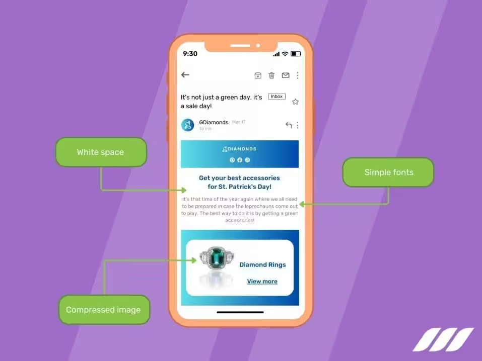
- Give your CTA the room to breathe. Keep sufficient whitespace so it doesn’t blend in with the rest of the text.
- Ensure that the CTA button is large and easily clickable.
- To make it more prominent, you can use visual cues such as arrows or icons.
3. CTA not Matching the Email Message
One of the biggest mistakes you can make in your emails is writing the opposite or the wrong CTA. This means that if your email promotes a blog post and the CTA says “Buy now”, this confuses the reader and throws them off. Make sure to maintain consistency in your message, the tone, and the CTA. It is one of the basic email engagement tips that ensures that the user’s experience is cohesive and builds up credibility with their audience.
How to Fix it?
Use specific and to-the-point CTAs that clearly state what the reader will receive if they click on it.
For example, “Download your free guide” instead of saying “Visit for more” or “View more”. Keep the language simple and action-oriented.
Focus on keeping your CTA aligned with the email’s content and purpose for consistency. A strong, clear CTA helps guide readers, increases engagement, and encourages them to take the next step.
4. CTA Lacking Urgency or Incentive
One of the email copywriting best practices is to create a CTA that has urgency. If it lacks urgency or any compelling incentive, readers might delay taking action. Phrases that don’t convey the time-sensitive benefits can often get overlooked in crowded boxes where decisions are made in seconds.
How to Fix it?
Here is a table comparing the wrong and the right CTA, and how one fails and the other one succeeds:
| WRONG CTA | WHY IT FAILS | RIGHT CTA | WHY IT WORKS |
| Click Here | Too vague, no clear benefit | Get 30% off on your first order | Highlights the benefit and creates an incentive |
| Submit | Generic, lacks context | Offer available till Sunday!! | Sets clear expectations and motivates engagement |
Personalisation can significantly improve the effectiveness of your call-to-action by aligning it with the subscriber’s intent. This is why professional email copywriting services are used by companies to ensure that they maximise traffic through email marketing to their business.
5. Using the Same CTA for All of the Subscribers
Subscribers do not come at the same stage of the customer journey. They can disengage when the same CTA is sent to all people, starting with new subscribers and then continuing to engage with long-term customers. An offer to buy now will not be appealing to the person who has just signed up and has yet to establish trust with your brand.
How to Fix it?
Divide your email list by behaviour, interests, and position in the buyer cycle, and then customise your CTA.
To attract new subscribers, a call to action that says “Explore our services” may be used, whereas to draw interest from an existing customer, it may be recommended to say to them, “Get your exclusive discount.”
One of the most radical methods online copywriting services use to enhance the effectiveness of your CTA is personalisation, in which they make your CTA in line with the intention of the subscriber.
6. Using Too Many CTAs in Your Email
While it seems beneficial to give readers multiple options, too many CTAs can be too much, which causes confusion and indecisiveness. When a user is presented with numerous choices, they tend to choose none at all. Emails with too many CTAs dilute the message.
How to Fix it?
- Stick to one clear CTA per email to avoid overwhelming the reader
- If multiple CTA’s are required, prioritise them by importance
- Highlight the main CTA visually
- Only use secondary CTAs in a supporting role
This point is also important to produce mobile-friendly email CTAs so that the email doesn’t look cluttered or confusing.
FAQs
Can I use emojis in my email?
Yes, you use emojis in your email if it’s relevant to the audience and the tone.
What is the best time to send emails?
The best time to send an email is from Monday to Thursday between 9 AM and 11 AM.
How important is the subject line in email marketing?
It’s quite critical as it directly impacts whether your email will be opened or closed.
CONCLUSION
The CTA is your bridge between the reader and their action. A strong email CTA should be clear, visible, relevant, and targeted, with a focus on urgency.
Many email campaigns fail because they are reluctant to improve the above 6 pitfalls that are discussed in detail. Make sure you apply the fixes and improve your marketing effectiveness drastically. Don’t leave the readers to guess what they should do next; instead, guide them through the next step.


Comments are closed here.