How Dopamine Design is Dominating Food Brand Packaging?
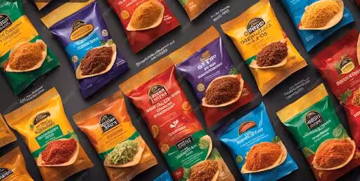
If you walk down any supermarket aisle today, you’ll notice a seismic shift happening on the shelves. The era of muted colors, subtle typography, and minimalist artisanal packaging is rapidly giving way to a distinctly unapologetic and maximalist aesthetic.
This bold and vibrant trend is called Dopamine Design, and it’s intentionally engineered to trigger a tiny hit of the “feel-good” neurotransmitter in your brain!
However, don’t think dopamine design is just bright colors. It’s actually a calculated psychological strategy that operates on the brain’s reward system. In a world saturated with digital content and competing for attention, food packaging has to perform instantly. Find out how unlimited graphic design services are prioritizing this trend in the physical world and on social media feeds.
The Anatomy of Dopamine Design Packaging
The goal of this design style is to be visually arresting, injecting a sense of joy, optimism, and playfulness into everyday routines. It’s a direct cultural response to years of global stress. Consumers now actively seek out products that provide a momentary, cheerful escape. And graphic design subscription services in Santa Clara, California, are providing just that!
Key Elements
The elements that define dopamine design include:
- Vibrant and high-contrast colors: Think neon yellow, electric blue, hot pink, and lime green used in unexpected, clashing combinations. These colors are scientifically proven to grab attention. While we shall discuss food brands later on, we have to mention the full-service agency, Copa Design’s work with the De Anza College Latinx Association.
For the logo, this unlimited graphic design service in Santa Clara incorporated the Mesoamerican feathered serpent deity Quetzalcoatl in it. In bold pink, turquoise, blue, and orange, they created a logo that captures every Latinx community in an easily recognizable symbol. It grabs attention, connects to culture, and looks great on everything!
- Playful, oversized typography: Fonts are no longer reserved or elegant. They are dynamic, wavy, and often use mixed styles and weights to convey energy.
- Abstract and geometric prints: Designs leverage the visual energy of 1980s Memphis Design. It’s all about squiggles, zigzags, checkers, and layered graphics that create an almost hypnotic effect.
- Nostalgia and retro flair: The designs usually tap into a comforting, high-energy nostalgia, reminiscent of ‘90s graphic or vintage snack packaging. There’s a sense of familiar fun.
Food Brands Using Dopamine Design
Major food and beverage brands are ditching subtlety. Specifically, those targeting younger, digitally native generations are opting for this new, powerful visual language. So, how are branding and graphic design services in Santa Clara working with this style for brands?
- Omsom Noodles & Meal Kits
Omsom is a brand specializing in Asian meal starters, and it’s a prime example of the maximalist approach.
Their packaging is an explosion of clashing neon colors, bold color-blocking, and chunky typography. It actively rejects the muted, minimalist aesthetic often associated with authentic or artisanal products. Omsom has positioned itself with unapologetic fun and flavor. This instantly signals a high-energy, exciting culinary experience that you want to display on your counter.
- Fly By Jing Chill Oil
This brand has moved away from the reserved, dark-label look common in specialty condiments. Fly by Jing uses vibrant red and bright yellow with bold, almost hand-painted graphic elements and a dynamic logo.
The design is less about whispering exclusivity and more about shouting flavor and excitement! The package itself feels like a celebration, creating a crave-worthy visual expectation before the product is even opened.
- Confiserie Walter
Categories like chocolate are often considered to be traditionally high-end. But they are embracing the shift as well!
Speciality chocolate companies, such as Confiserie Walter, have swapped the classic metallic tones and embossed lettering for striking typography with a sense of high-energy modernity. This design choice aims to evoke immediate, joyful excitement among shoppers. It helps to differentiate the product from its more elegant, restrained competitors.
Ultimately, dopamine design is the industry’s way of battling for the consumer’s most precious commodity: attention. And unlimited graphic design services are doing an amazing job!
The mentioned brands are directly tapping into the brain’s reward system by prioritizing visual joy. This has ensured we choose their products instinctually and not just logically.
Dopamine design is a colorful, necessary pivot that acknowledges that in the modern marketplace, “feeling good” is just as important as tasting good!